
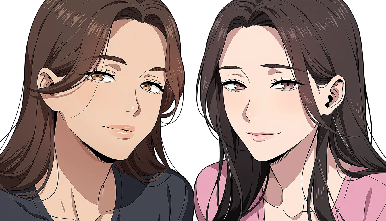
A difference in age between two adult characters is an ordinary narrative tool. It sets up different amounts of experience, different confidence, different things at stake. Drawing it is harder than writing it, because a picture has no dates in it. Everything has to arrive through the body, the clothes, the room and the way two people occupy space together.
The first requirement is not artistic at all. Both characters must be unmistakably adult, individually, in every image, without depending on context or a caption to establish it. That is the floor. An age gap is a relationship between two adults, and if either figure could be read otherwise the drawing has failed regardless of what the artist intended.
What actually signals adulthood
Adult proportion is the main carrier. Adult heads are smaller relative to the body, roughly one seventh to one eighth of total height, with a longer neck and a jaw that has real width. Shoulders sit wider relative to the head. Hands and feet are proportionally larger. These are structural facts and they read at thumbnail size, before anyone looks at a face.
Faces contribute less than people assume, because stylised faces are simplified and simplification pushes everything toward youth. Where a face does help is in structure rather than smoothness: visible cheekbone and jaw planes, a defined brow ridge, eye size that sits within the head rather than dominating it. Large eyes plus a small chin is the combination to avoid entirely.
How a gap becomes visible
Once both women read as adults, the gap comes from contrast between them rather than from any absolute. Slightly different proportions, a difference in how each carries her weight, one who has settled into her body and one who has not. Age shows more in posture and economy of movement than in any feature you could point at.
Wear is the other honest signal. Adults accumulate: a slightly worn jacket that has been kept for a decade, reading glasses, a haircut that was chosen once and never revisited. Contrast those against choices that look recent and provisional and you have a legible difference without touching either character's face.
Costume, setting and role
Clothing is the fastest and most reliable carrier, because clothes signal life stage directly. A tailored coat, a work uniform belonging to a qualified profession, house keys, a car. These say adult with no ambiguity at all and they say it from across a room. They also let you distinguish two adults from each other by what stage of life each is in.
Setting does the same work. An office, a flat that clearly belongs to someone, a bar. Rooms that only adults occupy carry age onto the people inside them. The corresponding rule is negative and absolute: no school settings, no uniforms associated with minors, no visual grammar borrowed from work about children, regardless of what the accompanying text claims.
What creates ambiguity
Ambiguity comes from a small set of repeatable mistakes. Head-to-body ratios below about six. Eyes occupying more than a third of the face height. Absent jaw and neck structure. Costume and props drawn from adolescence. Framing that emphasises smallness against a much larger figure. Any one of these can undo an otherwise adult design, and together they are disqualifying.
The practical test is to remove all context. Crop out the room, remove the dialogue, remove the other character, and show the figure alone to somebody who knows nothing about the story. If the answer to how old is she is anything other than an adult, the design needs work rather than an explanation.
Keeping an adult age gap legible
Work in this order: establish both adults independently, then build contrast between them through proportion, posture and wear, then use costume and setting to confirm what the bodies already said. Doing it in that order means the age gap is a layer on top of a solid foundation rather than something the reader has to infer.
This is a standard rather than a preference, and it is written into our reader agreement. The character-design side of the same problem is covered in the piece on what a character sheet must answer, and the proportion mechanics in the stylised proportion notes. Platform-level safety controls stay on adult character safety.