
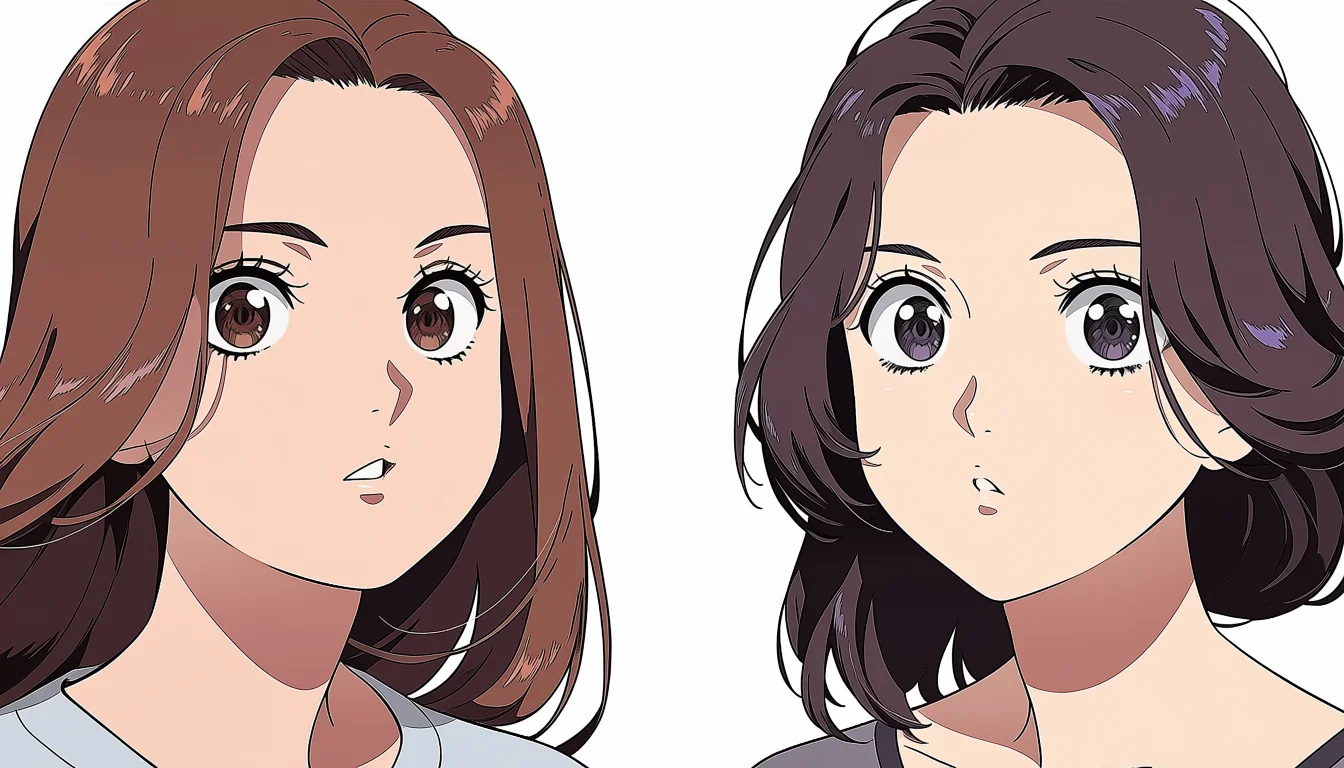
A stylised character on paper is really a set of drawings that each cheat a little. The eyes are large in front view and quietly shrink in profile. The chin narrows when it helps. None of that survives being built as a solid object, because a solid object has to be correct from every angle at once. That is the whole difficulty of taking a drawn design into three dimensions.
Drawn cheats do not rotate
Take the classic large-eye design. Modelled literally, the eyeballs become spheres so big they collide inside the skull, and in three-quarter view the far eye pushes out past the cheek. Production models solve this with eyes that are not spheres, sockets that are not symmetrical, and in some cases geometry that reshapes itself as the camera moves.
The same applies to the jaw, the nose, and the distance between features. A design that reads as charming from the front can read as strange from above. Modelling is therefore a negotiation, and the honest version of the job is deciding which angles matter for this production and making those angles right rather than chasing an impossible everywhere.
Proportion fights the rig
Small waists, thin wrists, and short upper arms all reduce the amount of geometry available to bend. Deformation quality depends on having enough loops across a joint, and a stylised limb often has very few. The result is pinching at the elbow, a shoulder that collapses when the arm lifts, and a hip crease that appears out of nowhere at forty degrees.
The fixes are known: extra edge loops at joints, corrective shapes that fire at particular angles, and helper joints that keep volume. All of them cost time and file size. Budget for them, because a beautiful model that cannot lift its arm is not finished, it is a sculpture, and the difference shows up in the first animation test.
Shading notices what you simplified
Stylised forms are simplified forms, and simplified forms produce large flat areas that shading has nothing to grip. A cheek with no structure reads as a balloon. The usual answer is to keep subtle planes in the sculpt even when the silhouette is smooth, so the light has something to break across without the model reading as detailed.
This matters more with flat-band shading than with realistic rendering, because a band edge is a hard line that traces whatever form is underneath. If the form is vague, the line wanders. Our notes on making a 3D model read as drawn go further into the shader side of the same problem.
Lenses exaggerate a stylised face
A wide lens close to a face pushes near features toward the camera. On a realistic head that reads as intimacy. On a stylised head with already-large eyes it reads as a funhouse mirror. Most stylised productions live between 35mm and 85mm equivalent and reserve wider glass for shots where the distortion is the point.
Test the design under the lenses you plan to use before the model is approved. A five-minute turntable at three focal lengths will tell you more than an hour of argument, and it catches the case where a design only works in the orthographic view somebody drew it in.
Choosing proportions you can actually build
There is a cheaper route than solving all of this, and plenty of studios take it: pull the design back toward buildable proportions before modelling starts. Slightly smaller eyes, slightly thicker wrists, a jaw with some actual width. The drawing loses a little charm and the production gains weeks. That trade is worth making explicitly rather than discovering it halfway through a shot list.
Write the rules down: head height, eye size relative to the skull, minimum limb thickness, how far a cheat may travel. A short written standard keeps a team consistent and gives a modeller permission to push back on a drawing that cannot exist. Without one, every model becomes a private argument that gets settled by whoever is most tired.
Then test the rules on one finished character before committing to a cast. Characters here are fictional and unmistakably adult, and holding a clear adult silhouette is part of the proportion standard rather than an afterthought. The colour side of the same decision is in the palette notes, and the wider studio route is on the studio page.