
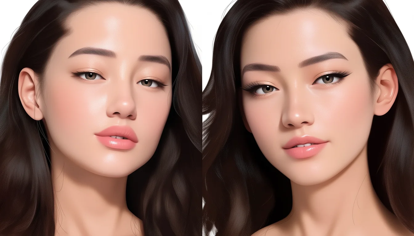
People talk about the uncanny valley as if it were a place you reach by being too realistic. That is not quite it. The discomfort comes from mismatch: one signal says human, another says not, and the viewer's brain keeps switching between the two readings. A cartoon face never makes the first promise, so it never breaks it. A near-real face makes it constantly.
Mismatch is the mechanism
The word covers a real effect even if the original curve was more of a sketch than a measurement. What people reliably report is a narrow band where something looks almost like a person and the almost is the problem. Outside that band, in either direction, viewers are relaxed. Cartoon faces sit well below it and photographs sit above it, and both are comfortable places to work.
Consider a face with photoreal skin, real pores, correct subsurface scattering, and eyes that do not move quite right. Every part of that description is a compliment except the last, and the last is the one that decides how the face feels. High fidelity raises expectations across the board, and any element that lags behind now reads as wrong rather than as stylised.
Reverse the mix and nothing bad happens. Flat cel-shaded skin with slightly stiff eye movement reads as a style choice. The audience has already agreed to a set of conventions, and stiffness fits inside them. This is why consistency matters more than quality: a coherent set of simplifications is comfortable, an incoherent set is not.
Eyes and mouths carry the risk
Most of the discomfort concentrates in two places. Eyes because we read attention from them constantly, and any lag, any missing saccade, any pupil that fails to react to light registers immediately. Mouths because speech and breath produce motion we know intimately, and a mouth that moves without the cheeks and throat responding looks like a puppet.
Practical consequences follow. If you are going to spend, spend there. Add eye darts. Let the lids follow the eye down. Give the mouth some corner deformation instead of only opening and closing. In a close intimate scene between two fictional adults, these small signals do more for believability than another million polygons on the body.
Motion can push a good still into the valley
A render that looks fine as a frame can feel wrong the moment it moves. Stillness hides the absence of micro-movement; motion advertises it. A character who holds a pose perfectly still for two seconds reads as switched off, because a living body never does that. Add a low-amplitude breathing cycle and a slow weight shift and the problem often disappears.
The reverse also happens: motion can rescue a mediocre model. Convincing weight and timing buy a lot of forgiveness. That is one reason the animation notes in the piece on floaty motion matter more to the finished impression than most modelling decisions do.
Designing out of the valley on purpose
The safest route for a small team is to commit to stylisation and stay there. Pick a level of abstraction and apply it everywhere: skin, hair, cloth, eyes, lighting. Resist the urge to make one element photoreal because a tool made it easy. That single upgrade is what usually drags an otherwise pleasant film into discomfort.
Test with people who have not seen the work. Describe nothing beforehand. Ask what feels off. Viewers are unreliable at diagnosing but very reliable at detecting, and the location of their unease is usually accurate even when the reason they give is not.
Staying out of the uncanny valley
One more habit helps: keep a reference wall of work that sits comfortably at your intended level of abstraction, and check new renders against it rather than against a memory. Comfort is a comparative judgement, and the comparison your audience makes is with other things they have seen recently, not with an abstract ideal of how a face ought to look on screen.
So the working rule is: match your promises. Decide how human the face claims to be, then make every other part of the character keep that claim. Realism is not the enemy, and neither is stylisation. Inconsistency is, and it is the one thing that a bigger render budget will not fix.
All of this assumes characters that are fictional and unmistakably adult, which is the standard set out in our reader agreement. If you want the shader-level version of the consistency argument, the cel-shading piece covers it, and proportion decisions are handled in the notes on stylised proportion.