
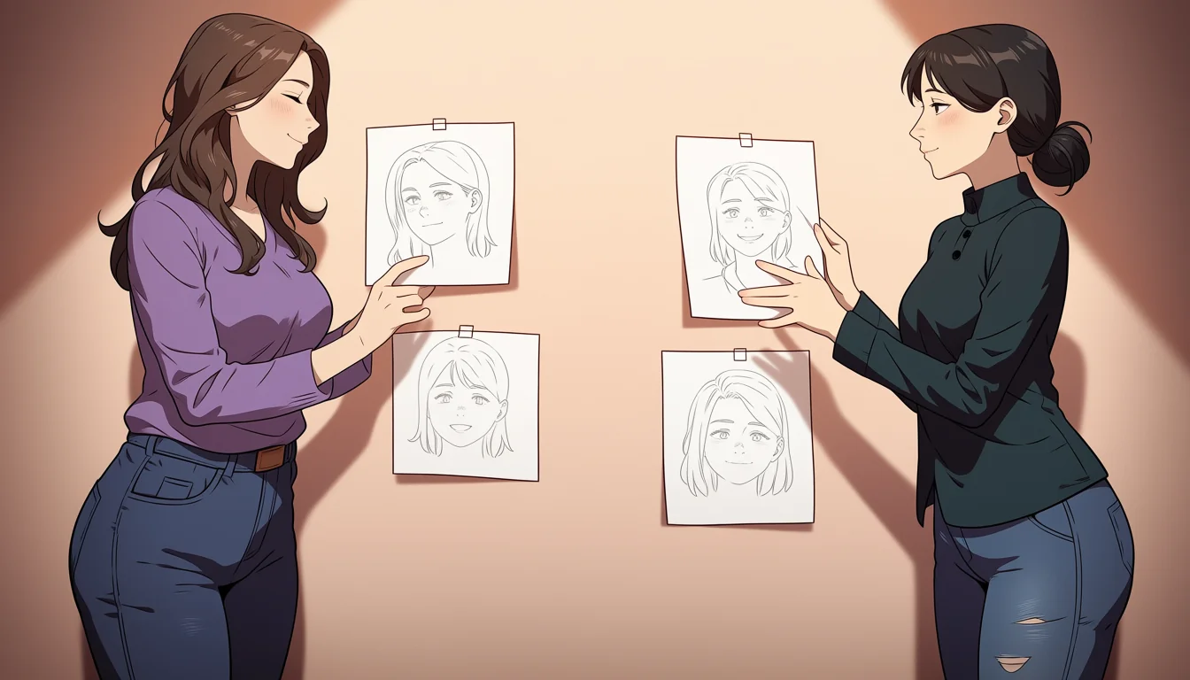
A thumbnail is a drawing about three centimetres across, made in a minute or less, containing shapes and values and nothing else. Working this way feels like avoiding the real work and it is the single most efficient stage in making a picture, because it settles the decisions that determine whether a piece succeeds and refuses to let you spend time on anything else.
The reason is constraint. At that size there is no room for detail, so the only available decisions are the ones that actually matter: where the shapes are, how the values are distributed, and where the eye lands first.
What a thumbnail decides
Composition, meaning where things are and how the frame is divided. Value structure, meaning which areas are light and dark. Hierarchy, meaning what a viewer looks at first, second and third. These three determine most of whether a piece works, and none of them require any drawing skill to test.
They are also the three things that are most expensive to change later. Rendering can be adjusted at any stage; a composition that does not work has to be rebuilt, which usually means starting again with several hours already spent.
Small forbids the wrong work
The real value of the size is what it prevents. It is impossible to render a face at three centimetres, so the temptation to start with the part you enjoy is removed. Artists who skip thumbnails frequently spend an hour on a head before discovering the figure does not fit the frame.
This is the same discipline as grey blocking in three dimensions, described in the blocking piece. Decide the cheap things while they are cheap, and do not start the expensive stage until the cheap one is settled.
Ten is the right number
One thumbnail is a first idea and first ideas are usually the most obvious ones. Ten takes fifteen minutes and produces at least two arrangements you would not have thought of, which is a very good rate of return for the time.
The comparison is where the value appears. Laid side by side, the differences between arrangements are obvious in a way they never are in sequence, and the strongest is usually identifiable within seconds by anybody, including people who cannot draw.
Value first, then anything else
Thumbnails should be done in a few values only, three or four at most. Working in flat greys forces the value structure to be decided rather than emerging from colour, and value structure is what holds a picture together, as argued in the palette notes.
Colour thumbnails are useful afterwards, as a second small stage, once the value arrangement is settled. Doing both at once usually means neither is decided properly and the piece inherits an unexamined default.
Thumbnails for sequential work
For comics, thumbnailing a whole chapter before drawing any of it settles pacing, panel sizes and page turns while they cost nothing, which is the layout argument in the piece on panel rhythm. It is the highest-value hour in the entire production.
It also reveals structural problems that are invisible page by page: a scene that runs too long, a beat that never lands, a page turn wasted. Fixing those at thumbnail stage costs minutes each.
Readers see thumbnails anyway
Most work is encountered small: in a feed, a search result, a grid of covers. A piece that reads well at three centimetres will be opened; one that does not will be scrolled past regardless of how good the full-size version is.
So the thumbnail is not only a planning stage, it is a prediction of how the work will first be met. Checking the finished piece back at that size is the last step of the same discipline.
Working small before working large
Draw ten small, in three values, compare them side by side, choose one, and only then work large. For sequential work, thumbnail the whole chapter first. Then check the finished piece back at thumbnail size before calling it done.
Characters here are fictional and unmistakably adult at every stage, as set out in the reader agreement.